
Quickly Improve the Readability of Your Website
| Are you curious how you can improve the readability of your website? You work for hours crafting the perfect blog post or website page, so why aren’t people taking a few minutes to read what you wrote?
Poor readability is a big reason why website visitors leave your website too soon. How can you improve the readability of your website?
|
Images break up text and aid in understanding
|
|
Readability is a BIG thing when it comes to websites. It's not necessarily an SEO ranking feature, but it does indirectly affect your website views.
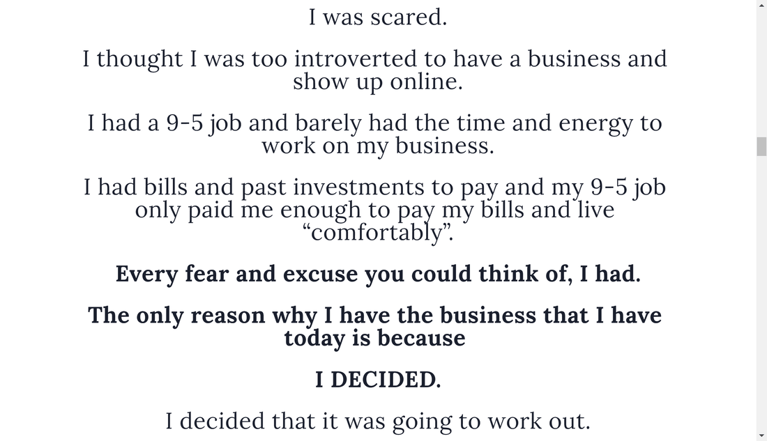
The longer someone spends on your site, the better your site will rank. If someone comes to your site and sees too many words, they might bounce right back off and head somewhere else. This guide will help you get readers to spend more time on your website by improving the readability of your text. Write with short paragraphsWhen you are writing your blog, use really short paragraphs. It's the number of lines that counts more than the number of sentences.
Vary the length of the paragraphs also. It's fine to have a paragraph that's just one line, but then make the next paragraph 3 or 4 lines. 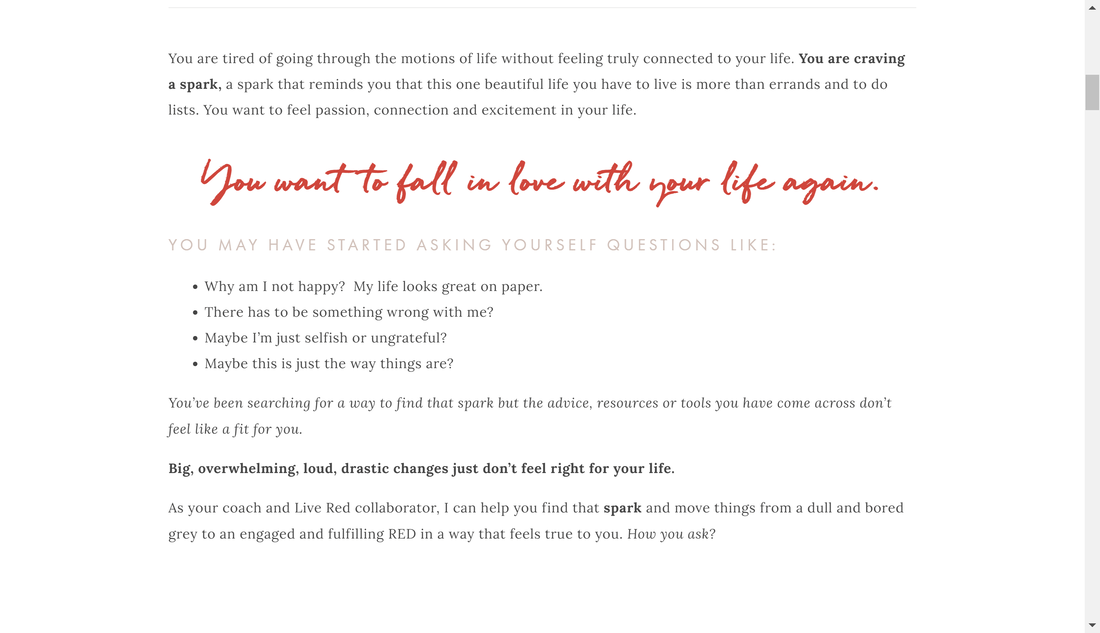
Notice how this website varies the length of paragraphs plus adds bold, bullets, and color to accent important text
Use headings and subheadings to increase "skimability"I'm not sure "skimability" is a word, but it works.
Most people don't read every word on a website. I doubt anyone does. What readers do is skim the headings, bullets, and other highlighted pieces of text to get the gist of what you're saying, then read the body of the text only if it sounds interesting or helpful. Is that what you've been doing as you read this article? 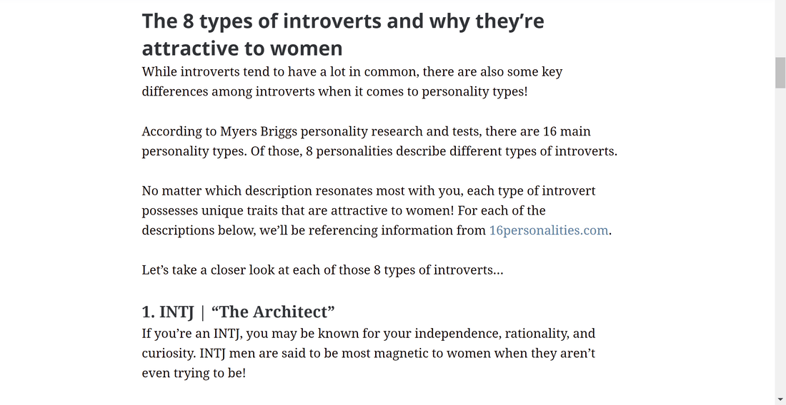
This article is using two levels of headings to break up text
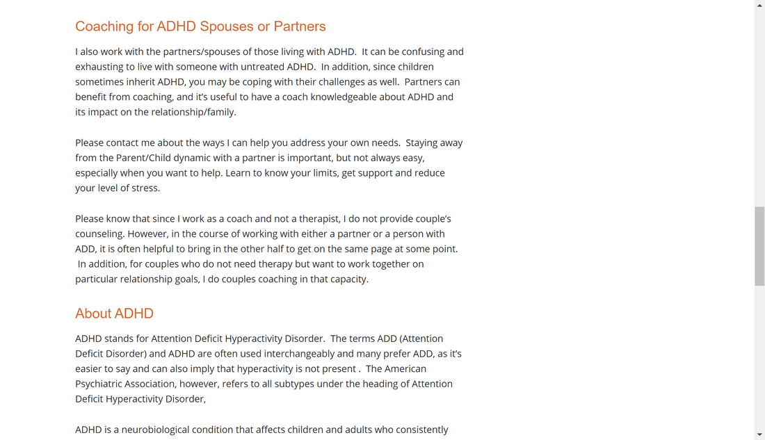
Make lists with bullets and numbersBullets and numbered lists are great ways to organize important information on a website.
Don't make everything into a list, but when you have information that can be broken down into a list, it will help that information stand out and be easier to read. The website below uses bullets really well. 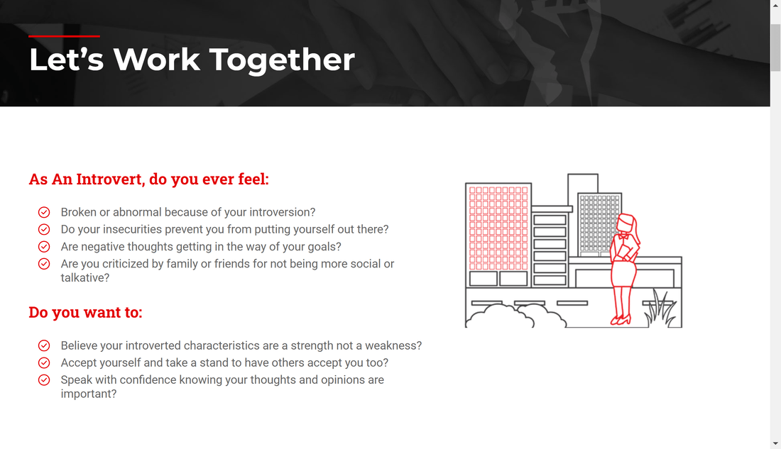
Use bullets to highlight important text
Use a font that's large enough...16 px is a good font size for most websites. If your audience is older, you might want to increase it to 18 or even 20.
For example, look at this screenshot below. The text is too small to read easily. 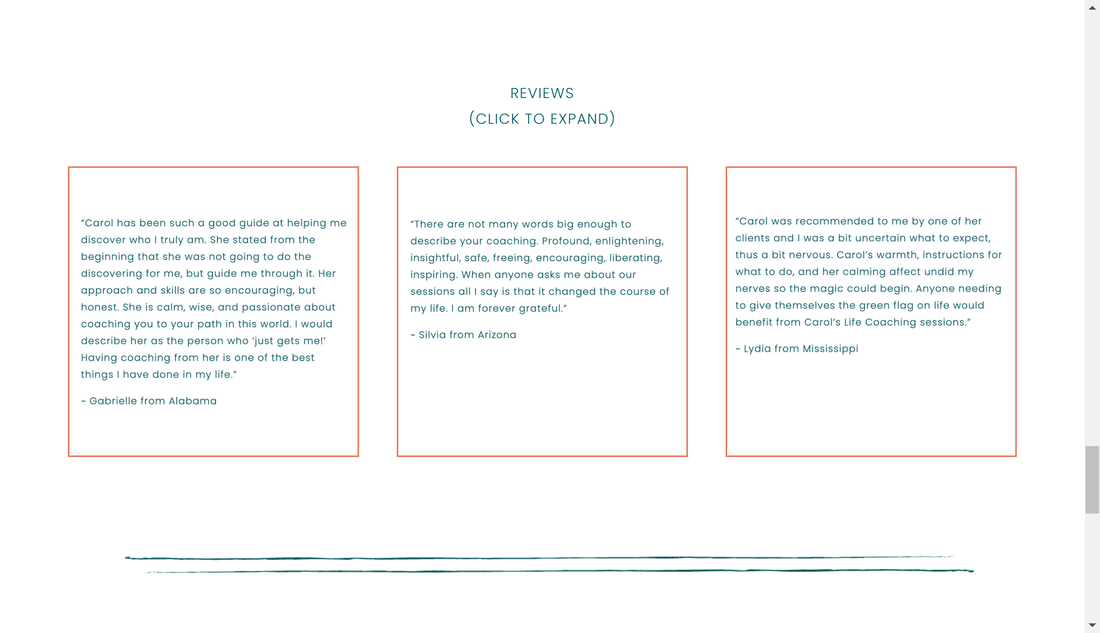
The text inside these boxes is too small and hard to read
...but not TOO largeHowever you also don't want to go to the other extreme and use a font that is too large. Larger fonts are great for titles, headings, and subheadings, but don't use them for body text.
Not only is the text too big, it's also centered like one huge heading
Use white space to narrow line widthIf you allow your text to flow all the way across the screen, your reader will have to move his or her head to get from the end of one line to the beginning of the next. This makes it easier for a reader to lose their place while reading.
Look at this screenshot to see how the text goes all the way across the screen. 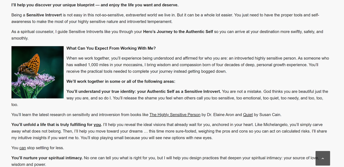
Compare that screenshot with this one to see how much easier it is on the eyes.
In the example above, they've used a large margin on the right side to narrow the width of the text.
Keep text left-aligned, not centeredIt's fine to center some text, especially for titles and other items you want to call attention to, but don't center large pieces of text.
If you center text, when the eye gets to the end of the line and goes back to the beginning of the next line, it's unsure where to look since centered text doesn't have a consistent starting point. 
This text would be easier to read if it was left-aligned and the font was a little bigger.
Use images to increase understanding Images are an important part of any website.
Images improve the readability of a website by:
Have the screenshots I've provided of different websites helped you understand the message? Be careful about placing text over an image. That makes the text harder to read and therefore decreases readability. |
Images can add a little fun to your website, too
|
| It's harder to read on a screen than on the printed page, so make it easy on your visitors and use the tips above to improve the readability of your website.
Here's an example of a blog post I formatted for a friend on her website using these tips: https://glendarobinson.weebly.com/blog/10-essential-oils-for-dealing-with-stress Do you have a website for your business that you love?
If not, let me help you! Schedule a free call today! |
